SciShield's Current Logo

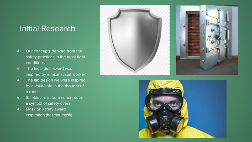
My Created Logo
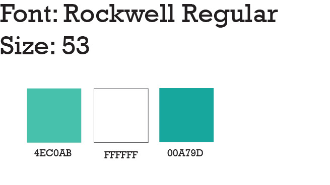
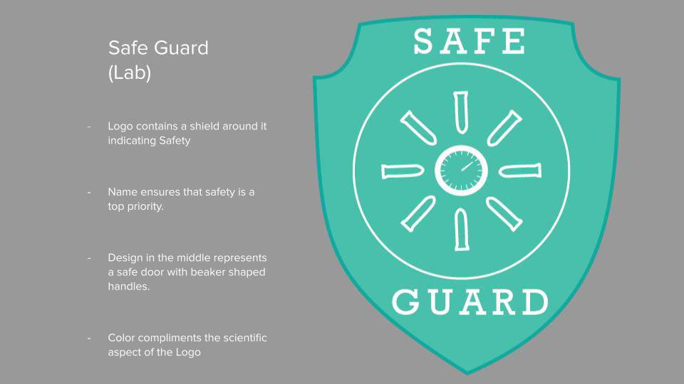
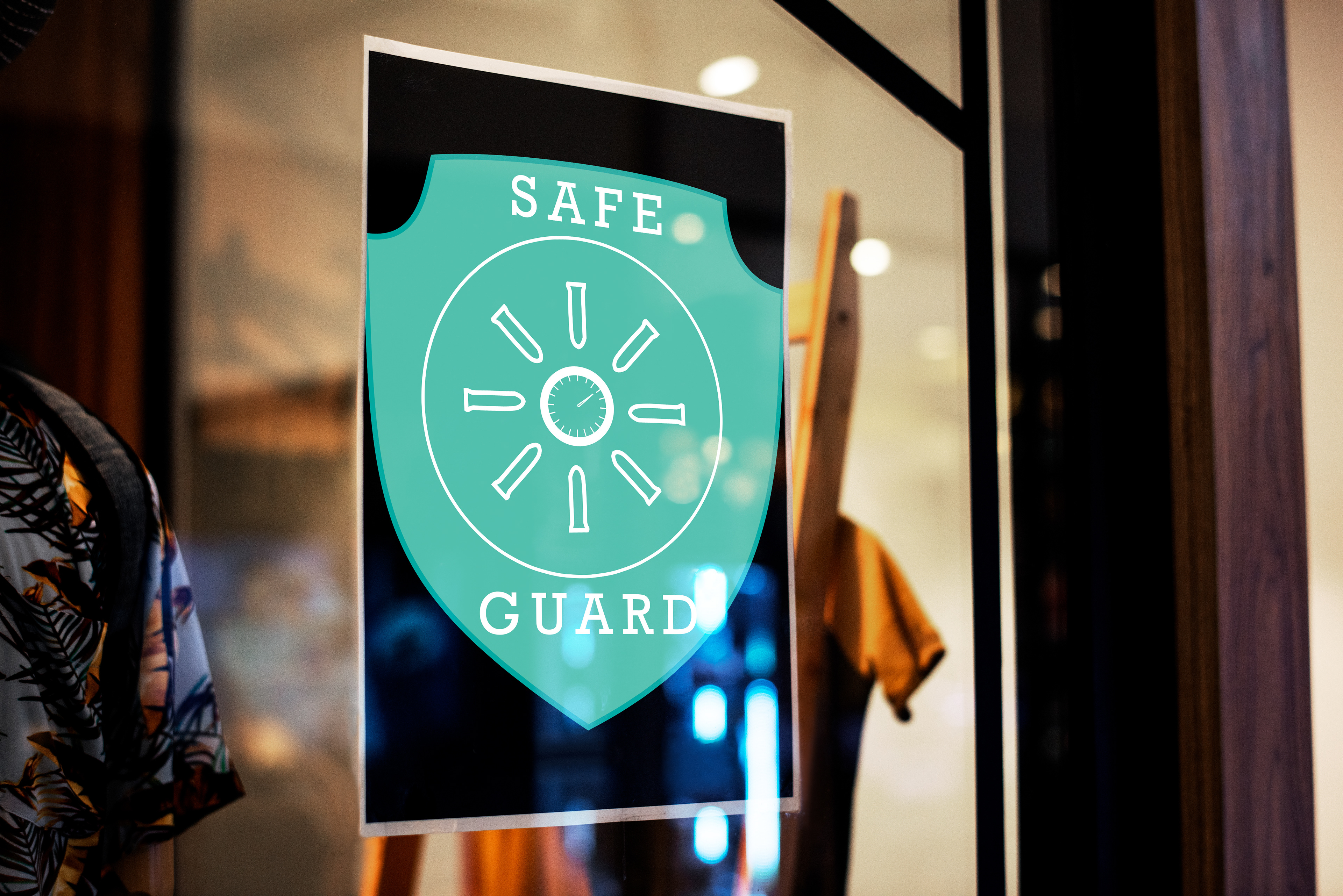
Mockup for my Logo (Lab)
Partner's Logo
Mockup for Logo #2 (Safety Award)
Designer Statement
The goal of this project was to work with another student in the class. In my case, I collaborated with a fellow Graphic Designer Khang Diep and we split the work in half. I worked on the logo for the company SciShield's Lab award while Khang completed the safety award logo for the company to be given to the workers for practicing excellent work while maintaining safety to the highest level possible.
Design Exploration
Through the making of this logo, I had a variety of trial and error designs which ended up making me stronger with creating the overall final product. I started out by researching more about SciShield and learned that they are a science company who makes safety a top priority. For the project, I ended up deciding on creating a logo with a safe that is opening open but it didn't work out due to the fact that it looked more like a book or journal rather than a vault safe door. I inputted the SDSU logo on it with the type saying " Safe Guard" and made the door contain SDSU colors. However, we received feedback and had to take a major turn to this project only to end up creating a completely new logo shown above as the final product with the words safe guard on it and the SDSU Webportal color and a white stroke.
Finalized Design Concept and Evaluation
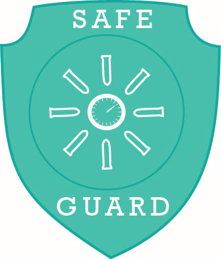
The final product that I created was a shield that was created using the pen tool in illustrator indicating safety and the middle are test tubes revolving around in a circle, acting like a door handle with a scientific speedometer in the middle representing science and safety being inside of the shield. The colors picked were used by SDSU and I thought that it had a nice touch on the overall logo for SciShield.